

How to Build SEO Dashboards in Looker Studio (with Examples)
-
Author
saurabh garg -
Date
October 28, 2025 -
Read Time
8 Min


Fill in the Form below for a no-string attached free technical discussion.
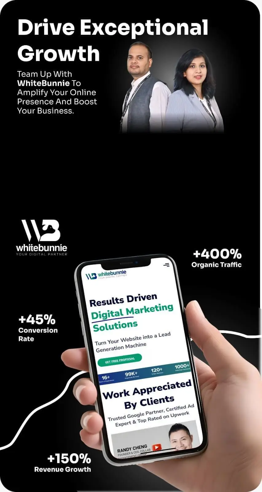
Tracking your website’s performance is not a luxury; it is a necessity. For businesses in India, where digital competition intensifies every day, understanding your search engine presence separates success from stagnation. Google Looker Studio stands out as a powerful, free tool to bring all your SEO data into one clear, visual space.
This guide walks you through the practical steps of building an SEO dashboard that delivers insights, not just data.
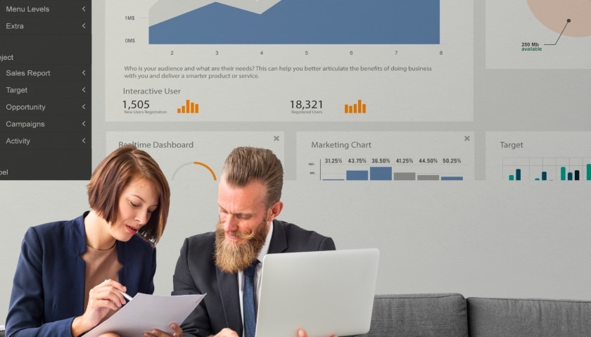
Raw data from Google Analytics or Search Console is often messy and disconnected. You find yourself jumping between tabs and spreadsheets, struggling to see the complete picture. A Looker Studio dashboard solves this.
It consolidates information into a single, visual report. You see trends at a glance, understand what content resonates with your audience, and track keyword performance over time. For teams at White Bunnie, this means faster decisions and clearer communication about what drives organic growth. It turns complex data into a simple story anyone can understand.
Before you build, you need data. For a foundational SEO dashboard, focus on these core connectors.
Google Search Console: This is your window into search performance. It shows your clicks, impressions, average click-through rate (CTR), and the actual keywords people use to find your site.
Google Analytics 4 (GA4): This tells you what happens after the click. It provides data on user engagement, traffic acquisition, and on-site behaviour.
A Keyword Tracking Tool (Optional): For businesses targeting specific keywords, tools like SEMrush or Ahrefs can track your daily rankings. Looker Studio can connect to these via their community connectors.
Linking these sources gives you a 360-degree view: from the search query to the user’s journey on your site.
Let’s construct a basic, yet powerful, SEO performance dashboard.
Log into Looker Studio and click “Create” followed by “Report.” Click “Add Data” and select the Google Search Console connector. Choose the correct property and add the “Site Impression” table. Repeat this process to add your GA4 data.
Start with a high-level summary section. Use the “Scorecard” tool to display your most critical metrics.
Total Clicks (from Search Console)
Total Impressions (from Search Console)
Average CTR (from Search Console)
Total Users (from GA4)
Average Engagement Rate (from GA4)
Place these at the top of your dashboard. This gives anyone a five-second overview of your core health.
Numbers without context have limited value. Below your scorecards, add a “Time series chart.”
Plot Clicks and Impressions over the last 3-6 months. This visual instantly shows if your visibility is growing, declining, or seasonal. You can add a second Y-axis to plot your Average CTR on the same chart, revealing how your snippet effectiveness changes over time.
This is where you find your golden insights. Add two “Table” components.
Top Pages by Clicks: Connect this to your Search Console data. Set the dimension to “Page” and the metric to “Clicks.” This table shows you which of your website’s pages generate the most organic traffic.
Top Queries by Clicks: Create another table with the dimension “Query” and the metric “Clicks.” This reveals the actual search terms people use before visiting your site.
Seeing your top pages and top queries side-by-side uncovers clear opportunities. You might find a high-traffic page is ranking for a surprising keyword, suggesting a content expansion angle.
The real power of Looker Studio emerges when you blend data sources. Let’s connect search behaviour to on-site engagement.
Click “Blend Data.”
Add your Search Console data source and select “Page” and “Clicks.”
Add your GA4 data source and select “Page” and “Average Engagement Time.”
Join the two tables using the “Page” dimension.
Now, you can create a chart that shows both the Clicks a page gets from search and how long people stay on that page. A page with high clicks but low engagement signals a problem perhaps the content does not match the search intent.
Consider “Urban Pataka,” a Mumbai-based store selling artisanal snacks. They built a Looker Studio dashboard and noticed a key insight.
Their “Spicy Mango Pickle” product page was their #2 page for organic clicks. However, the blended data showed a low engagement rate and a high exit rate. The data told a story: people were clicking the search result but leaving without buying.
The White Bunnie team diagnosed the issue: the page loaded slowly on mobile devices and lacked clear delivery information for Tier-2 cities. By optimising page speed and adding a prominent “Delivery Info” section, Urban Pataka saw a 40% increase in conversions from that page within two months. The dashboard identified the problem and tracked the solution’s impact.
Once you master the basics, explore these elements.
A Geographic Map: Use GA4 data to see which Indian cities (e.g., Delhi, Bangalore, Hyderabad) send you the most organic traffic.
Device Breakdown: A pie chart showing the split between mobile, desktop, and tablet traffic. In India, mobile-first is not a strategy; it is the default.
Goal Completions Chart: Link your GA4 conversions (like form submissions or purchases) directly to organic traffic. This moves the conversation from “traffic” to “revenue.”
Your first dashboard does not need to be perfect. Start with the core components we outlined. As your business and questions evolve, so should your dashboard. The goal is to create a central source of truth that empowers your team to make confident, data-driven decisions for the Indian market. Build it, use it, and refine it. That is the true path to SEO clarity.

Saurabh Garg, the visionary Chief Technology Officer at Whitebunnie, is the driving force behind our cutting-edge innovations. With his profound expertise and relentless pursuit of excellence, he propels our company into the future, setting new standards in the digital realm.

Search engines today aren’t just matching keywords—they’re understanding meaning. That’s where Semantic SEO comes in. Instead of stuffing a page […]
Read Post »
Content marketing is no longer a fad—it’s the backbone of any business hoping to stand out online in 2025. While […]
Read Post »
We can maintain brand visibility by assessing how SERPs will change during these seasonal periods. Does your current SEO strategy […]
Read Post »
Powered by Creativity. Connected With Cities Worldwide.
Copyright © 2026 White Bunnie -All Rights Reserved